Steps in Choosing My Color Palette
Step 1 | The Building Concept
- What is the goal of the project?
- What is the story we are trying to tell. Examples: a story about the place, or the people who live there, about the light or the geometry, a story about openness or seclusion, a journey from light to dark.
- It’s helpful to have an image to draw on as a reminder of what the story is.
For this project, these are some of the things that come to mind:
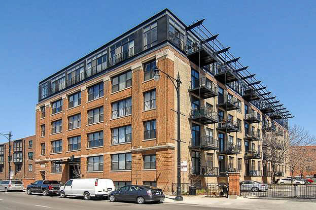
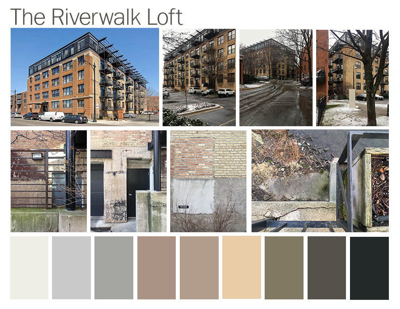
Our building is part of the Riverwalk Lofts which is an old factory building that used to house Hammond Organ factory from the early 1930’s until 1949.
The building is located on the Chicago River. We have a wonderful view of the river out our windows. The building also has a pier onto the river for kayak launching so there is a strong connection with the river. I think about the history of the river and how the river has gone from a neglected place that the city used as a dumping ground to a valued source of recreation and inspiration. This building was converted in 2001 so it was one of the early projects reconnecting with the Chicago River.
Step 2 | Pulling Colors from the Site
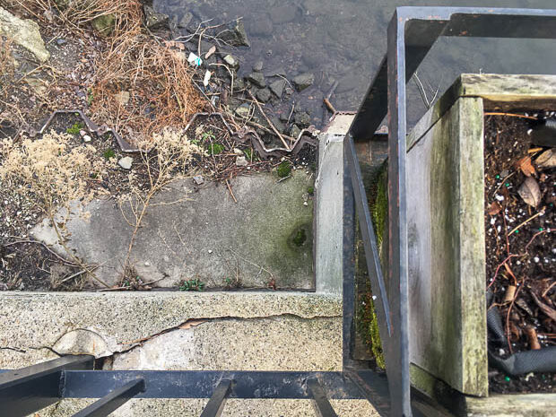
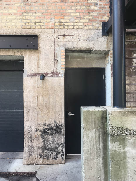
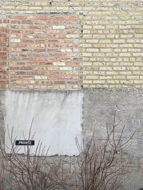
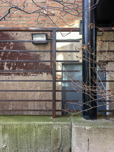
Start with materials in the environment. The photo above is a view down toward the river that captures some of the colors of the materials in the environment which include concrete, steel, weathered wood.
Inspiration from The Environment
These are some photos I took of the building and the surrounding environment.
Here is a board I made of images taken from around the building that capture the variety of colors from the materials along with samples of the colors in the environment at the bottom of the board.
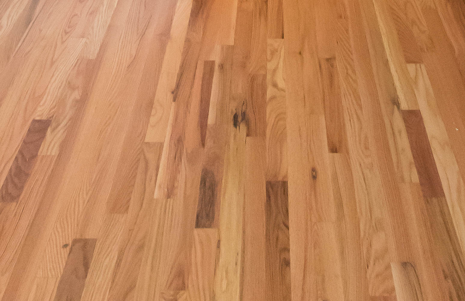
Step 3 | Working with Existing Structural Elements
These are the existing elements in the space that are not going to change anytime soon.


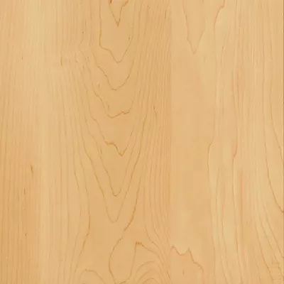
Step 4 | Working with the Existing Furnishings
These are taken from existing furnishings that we have and like or are stuck with.


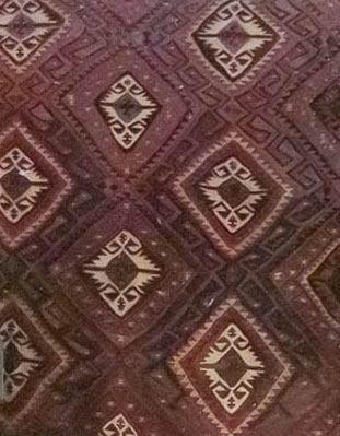
Below are color samples taken from and existing rug we have in the kitchen to try to figure out if there’s a complementing color that we can repeat throughout the space. This rug is kind of throwing me off because the colors don’t really reflect the other colors in the space or the colors from the environment. I’m trying to figure out if there’s a way to pull this all together and make this rug work in the space of if there’s some other solution.


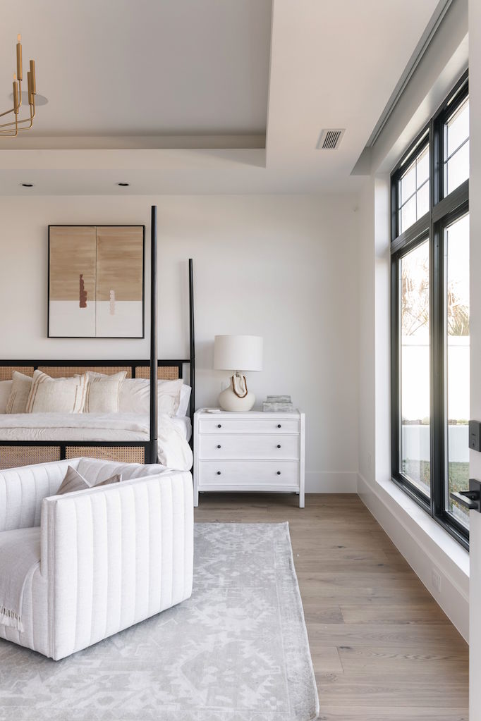
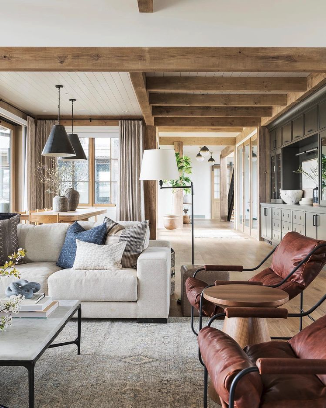
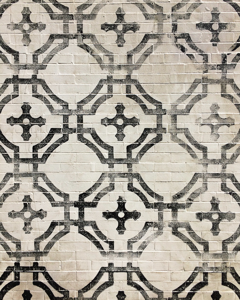
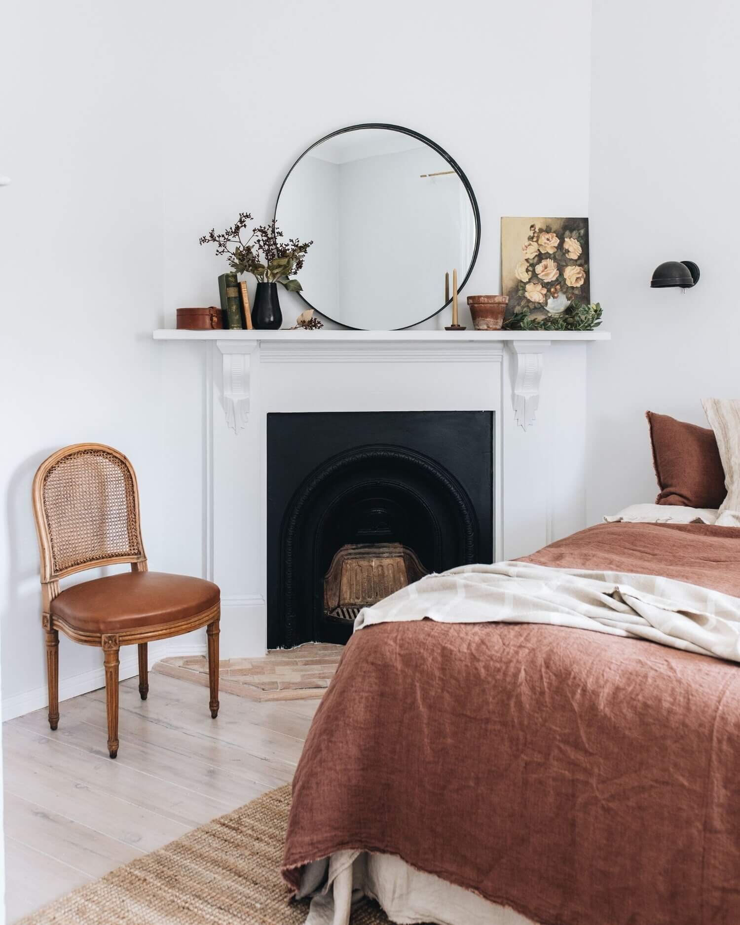
Step 5 | Inspiration from Other Spaces
This is a photo of a space that I really like. I actually all of the muted, earthy colors used in this whole project. They use a variety of colors throughout the home but they still seem cohesive enough. It seems like focusing on this type of color in our space as a secondary color could pull together the environment and some of the existing pieces.
Other Thoughts
These are some paint chips that I’ve been considering of other neutrals that we could use to paint the cabinets or perhaps as other colors throughout the space.
The large paint chip on the left, White Dove, is what the space is currently painted in. The black below it is Mopboard Black which is the color that all of the beams in the space are painted in.
The chips on the right are recommendations from a designer who we consulted with when we thought we were moving and she was choosing colors to help sell the place.


Other Possible Colors


I agree that these paint colors work well with the existing granite and existing tile on the bathroom floor but I’m not sure they work that well with our furniture. We do want the place ready to sell, if we ever decide that we’re actually finally ready to do that but in the meantime, we’d like it to look nice with the furniture we have. We’ve been thinking we were going to move for over three years now (!) so I think it’s time we paint it and decorate it in a way that we like since I believe we might as well enjoy it while we’re here.